Clay
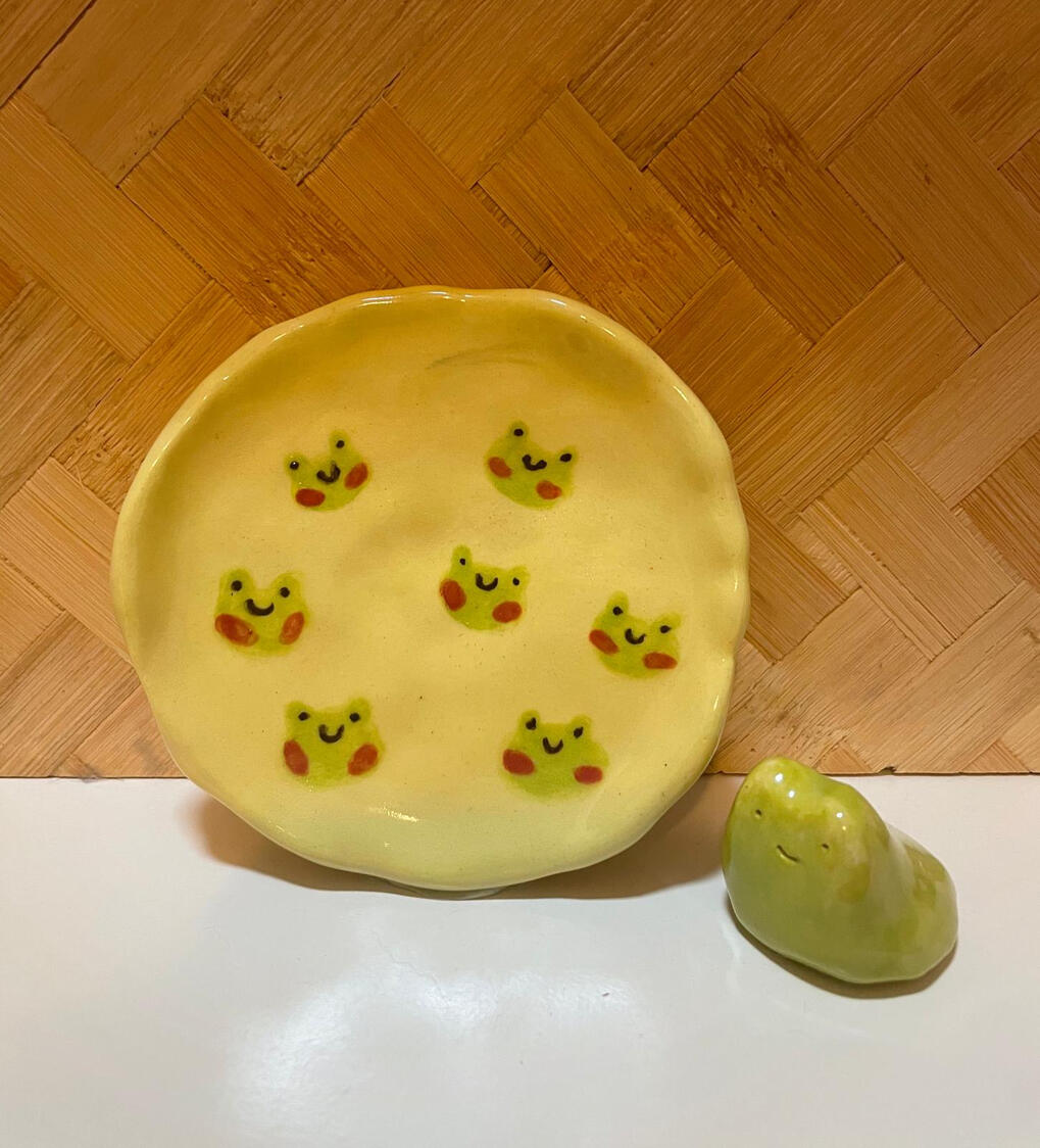
Germayne took inspiration from artists on Instagram such as @wawestudio and @theforestmori, whose works feature a simplistic yet charming design which contrasts the more traditional intricate pottery works. The design incorporates cutesy illustrations of frogs in pastel colours, giving it a cheerful feel.
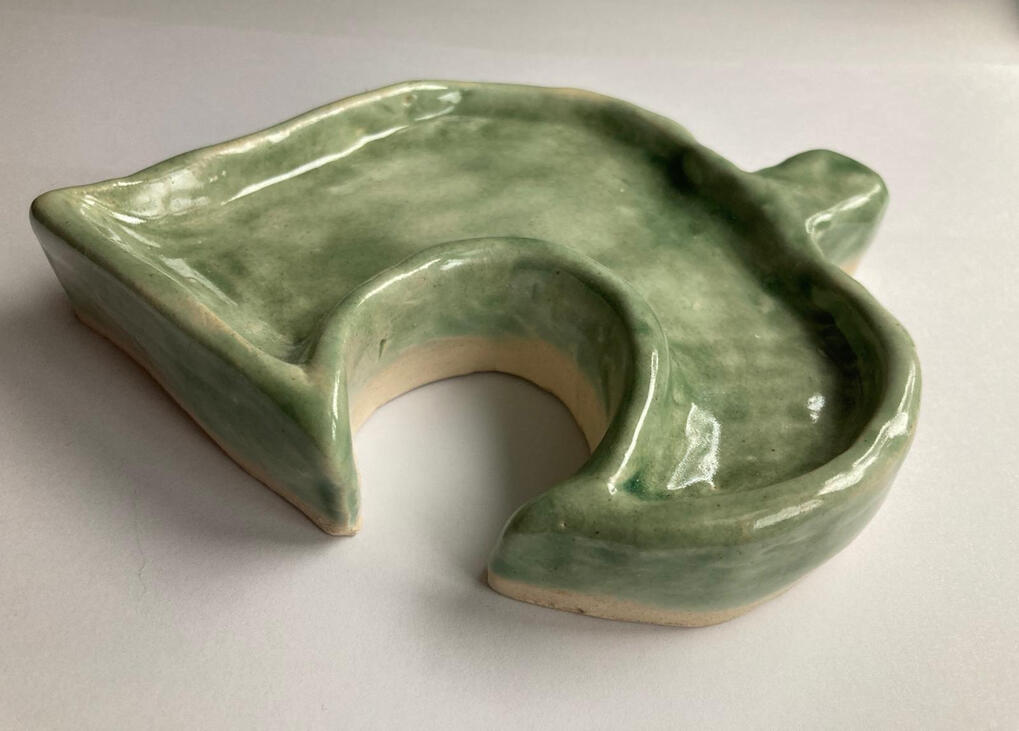
Krissa made a more contemporary take on classic pottery by making a leaf-shaped dish inspired by the modern Nintendo game “Animal Crossing”. The earth tone of the work provides a refreshing village feel to the dish, a contrast to the hustle and bustle of city life. Moreover, the soft silhouette of the work breathes an aura of tranquility to the overall presentation.
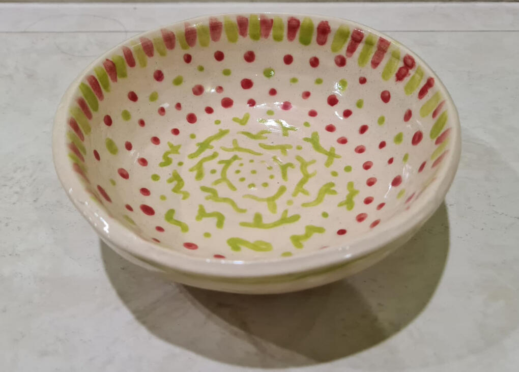
Hanisah, inspired by the vibrant colours of a watermelon, utilised the colours crimson red and pear green, in the design on the bowl. The design provides a new, more refreshing feel in contrast to the typical shape of a bowl
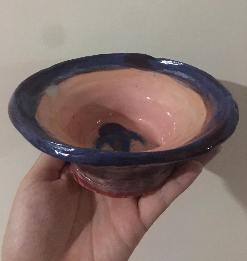
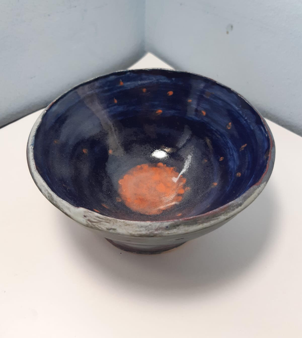
Vera crafted this piece with the intention of creating a delightful dessert bowl, which livens up the user’s everyday life. Her colour palette consists of a soft blush colour, contrasted with bold indigo. An especially unique feature would be the Koi fish painted at the bottom of the bowl, which reveals itself as the user finishes their dessert. This evokes serene images of Koi ponds, imbuing a sense of calm in the user. This elevates one’s dining experience, and would surely leave an impression on the user.
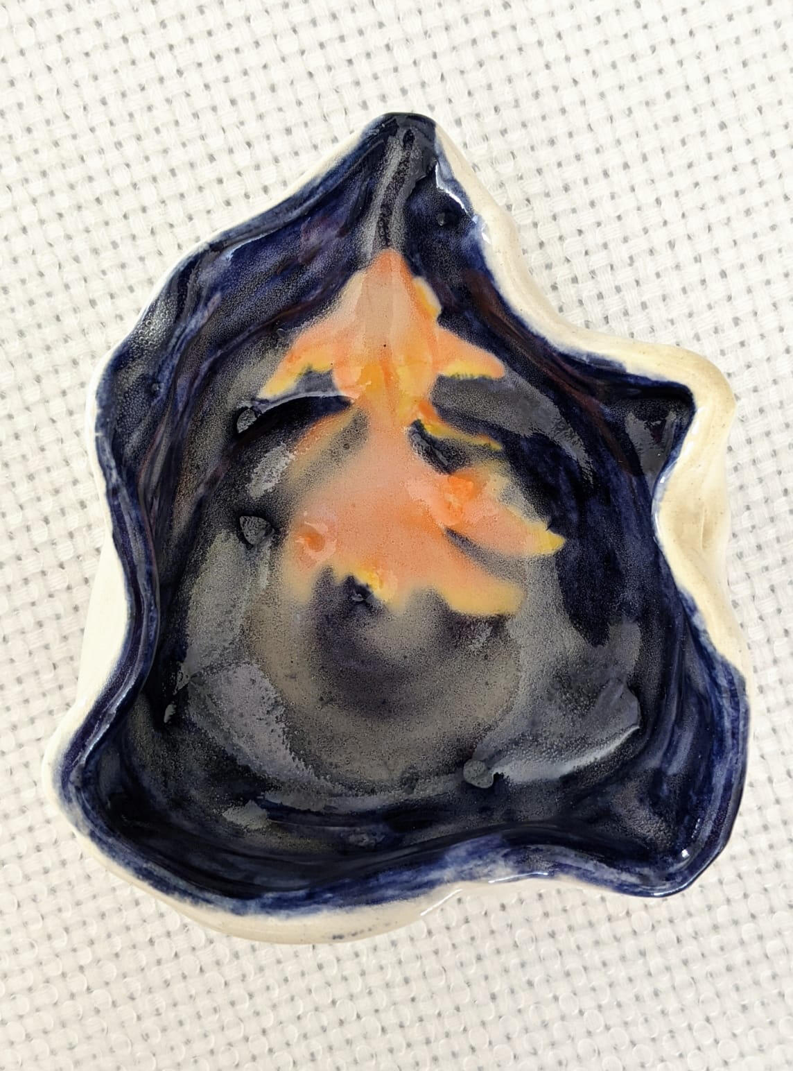
Like ripples in water, Wei Jun’s design started as random motions and shapes that eventually came together to form a dish that resembles a splash of water. The goldfish residing inside provides a balance of colour from the strong navy of the backdrop with a bright yellowish hue. The silhouette of its fan-shaped tail provided flow and harmony to the entire work.
Elliot took inspiration from nature, incorporating hues of blue and white, which symbolise the sky and sea, and painted fallen cherry blossoms. His piece has a very dreamy atmosphere, reminiscent of a balmy night. Interestingly, we also observe how the petals appear to be circling down the centre of the bowl, giving a whirlpool effect. In some cultures, the whirlpool represents turbulence, and those who are caught in it are said to suffer and are vulnerable to nature’s tempering.
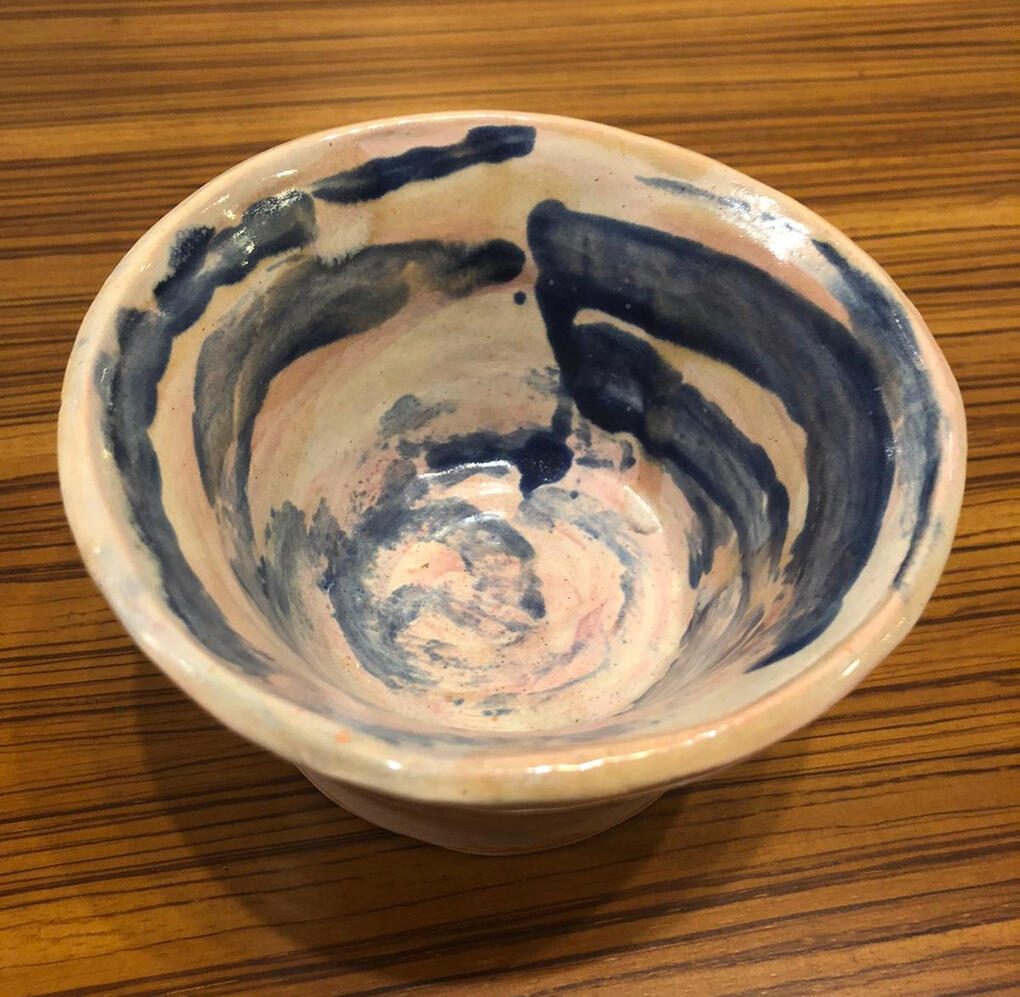
Wan Ying allowed herself to be in tune with her feelings when creating her artwork. The deep blue swirls of differing thickness and length were painted on to contrast the peachy pink colour of the bowl. The dominant pink colour of the bowl portrays unconditional love, which envelopes the blue colouration that represents trust and peace. In her work, Wan Ying demonstrates that tranquility can be achieved through affection for those she truly cares about.
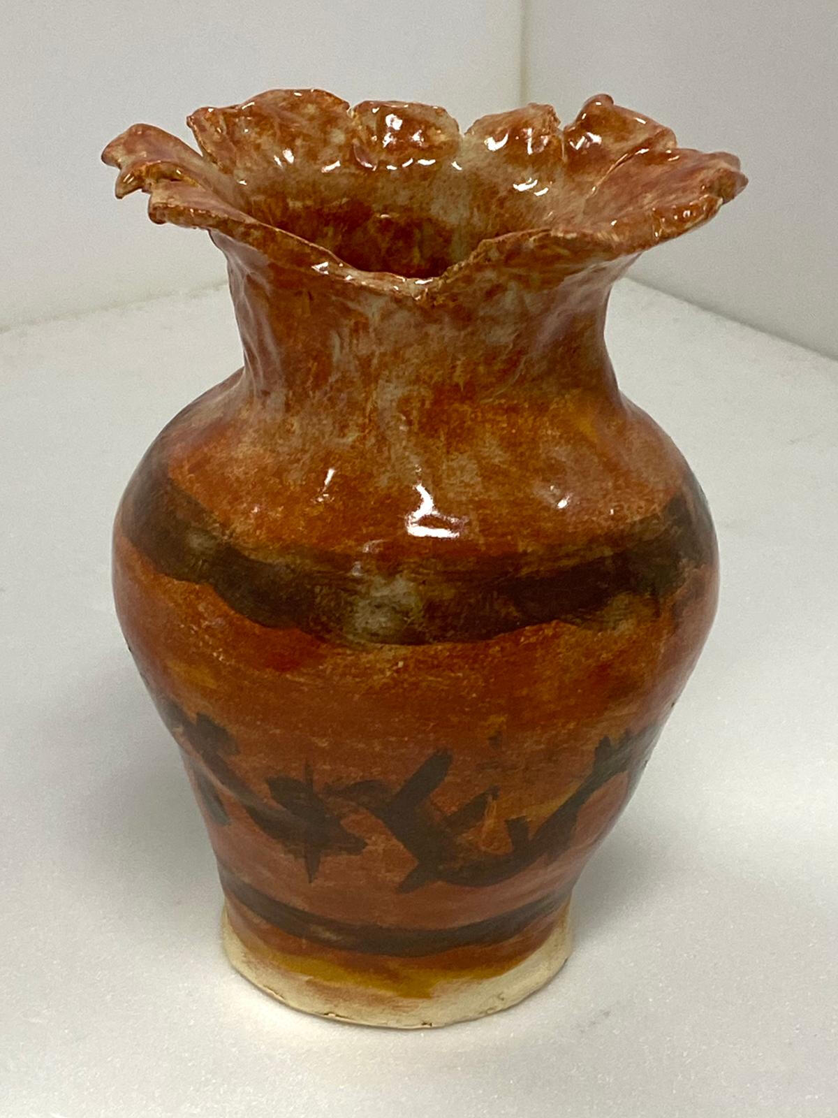
Caleb’s core design is based on classic Greek pottery with a brown backdrop and dark and stark contrasting motives around the circumference. However, the jagged mouth signifies a departure from the classic norm of pottery where works are expected to be orderly and couth. It represents Caleb’s appreciation of aggressive expressionism over conventional beauty.
Haru Tape
(Pictures where taken in Phase 3)
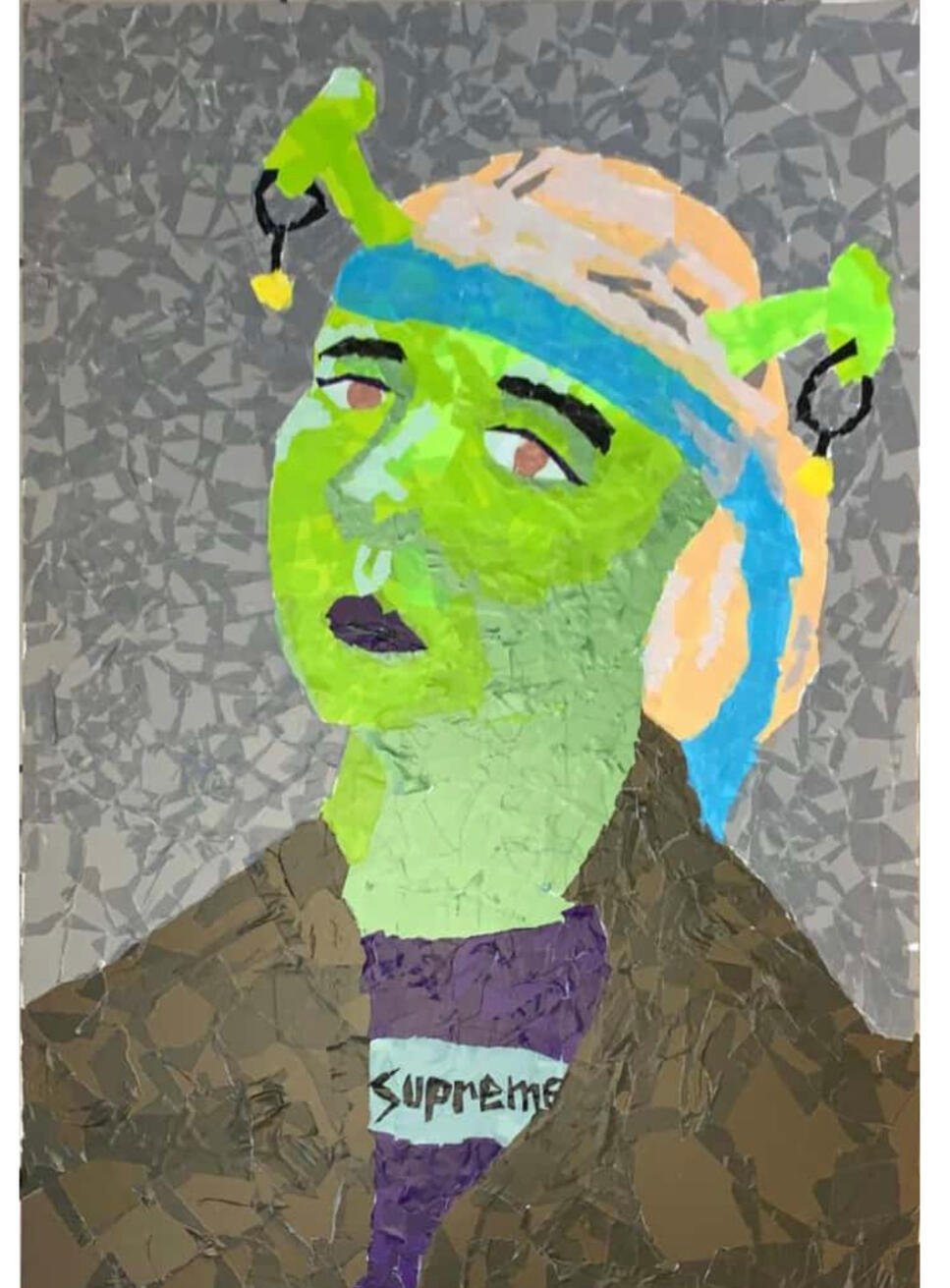
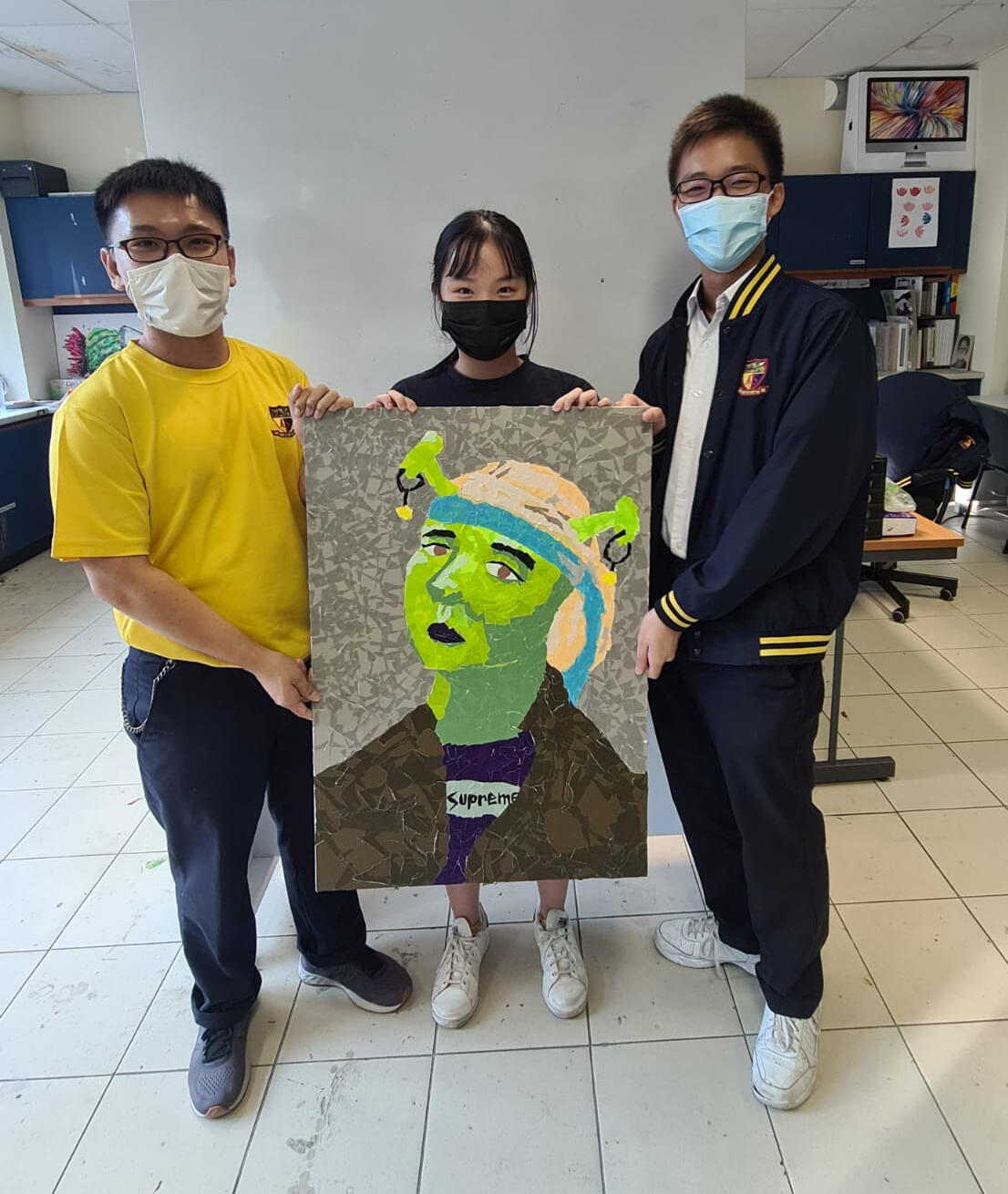
Inspired by Johannes Vermeer, the students decided to recreate the painting “Girl with a Pearl Earring”, but with a modern comedic twist. The work comprises numerous pieces of torn haru tape and pasted to create the shape of the subject matter. Elements of Pop Art, which is about making art accessible to all, can be observed in this work, where Shrek, a fictional character, becomes the main subject matter. This work is characterised by humour and created from the basis that art does not necessarily have to have a deep meaning behind it.
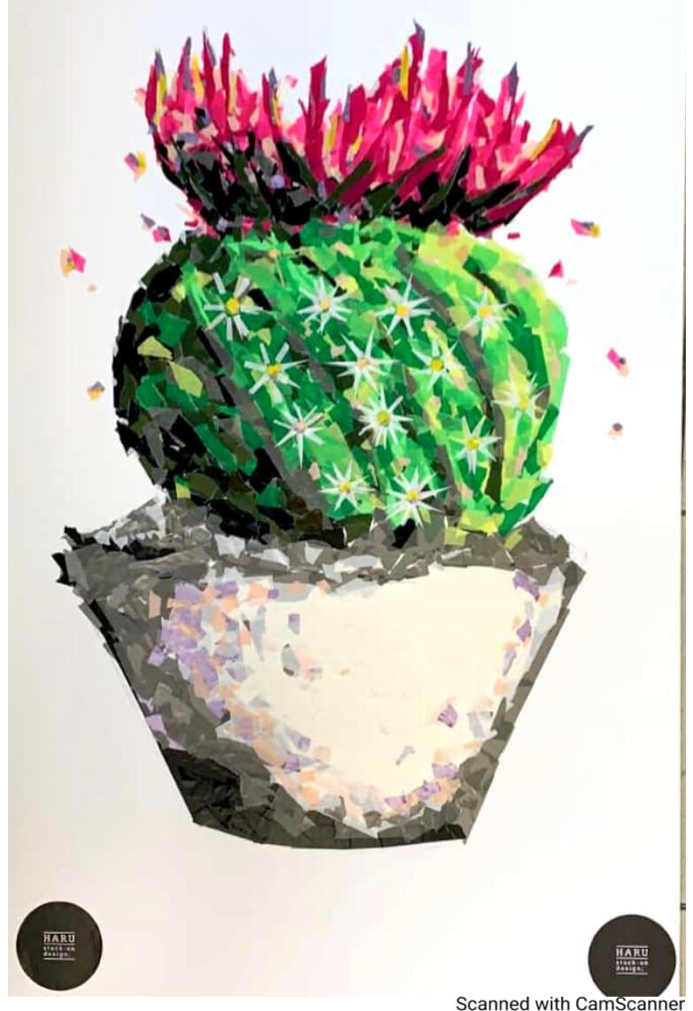
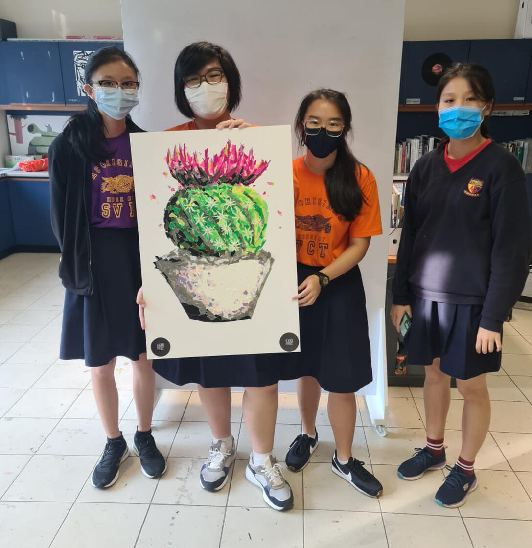
With the use of scissors, tweezers and other equipment, the team made use of refined techniques to create the subject matter, a Parodia Magnifica. The use of multiple layers, various tonal values and colours creates a perceived depth, attributing to the sense of realism observed in the work. The colours, magenta and forest green are contrasting, drawing attention to the textures in the work.
Lino cutting
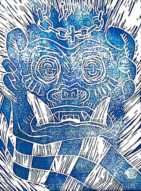
Owen’s lino print is based on Balinese legends and heritage. The print depicts the beast “Barong” being emphasised over a chaotic background. The checkered flag, which is also commonly seen in Balinese art, contrasts the background with its structured and cubic silhouette.
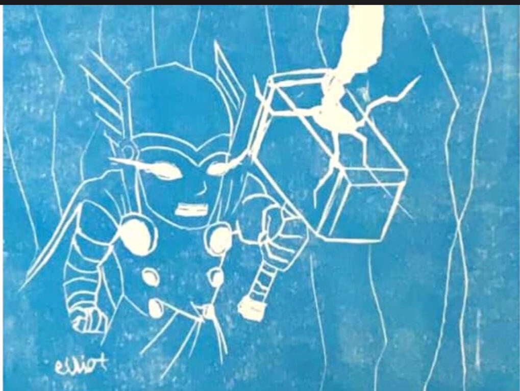
Elliot took inspiration from his favourite childhood superhero, Thor, The God of Thunder, from the Marvel Universe. Based on his own memory of the character, he created his work in chibi style, an art style popular in Japanese culture. The choice of colour creates a contrast between the striking white lightning and the azure blue sky. The simplistic design of Elliot’s work demonstrates his fondness and nostalgia for Thor.